Pair clashing styles to achieve classy combos
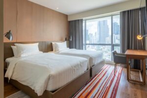
Minimalism. The art of using one color and a piece of furniture in a room and making people think you’re the coolest thing since the return of vinyl records. It’s is all the rage these days.
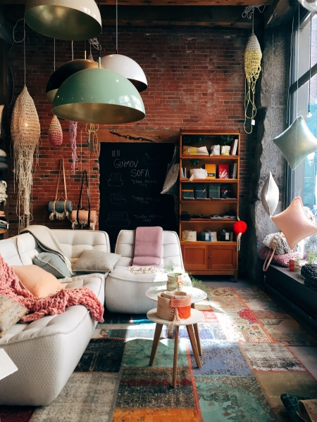
But what if you don’t like being minimalist? What if you’re obsessed with color, graphic chevrons, playful paisleys, and having a home that looks like a Real Living photoshoot?
Bright colors and playful visuals, when done right, can be really amazing. The busyness of prints stimulates the imagination, making rooms and homes feel more dynamic and full of energy.
So how to achieve this without making a glorious mess?
Match colors, not prints
Do floral and harlequin prints go together? What about herringbone and botanicals? If they have a color in common, chances are they will pair nicely.
Real Homes’ design expert Julia Kendell shares an expert tip: “Clashing prints from the same color palette work well if they derive from the same era. Mixing 1960s geometrics with Victorian florals, however, is likely to produce a look that confuses rather than sits together well.” In other words, you’re more likely to successfully mix prints from the same decade than prints from completely different eras. That’s not a hard and fast rule, but if you’re new to matching prints, it works as a basic principle.
Stick to the same color family
Use a color wheel to check color compatibility.
- Complimentary colors are those that directly oppose each other on the wheel.
- Analogous colors are those two colors on either side of your chosen, primary color.
- Triad colors are the colors you get when imposing a triangle over the wheel and using the three colors on each point.
Patterns that follow these hues will blend without offending design standards, so keep a color wheel handy whenever you’re doing a DIY project.
Treat stripes and polka dots as neutral prints
Stripe or polka dot prints practically go with anything. So if you’re looking to introduce a quick contrast in your home style, pair these with whatever you have on hand.
Combine large prints with small prints
Monotony – the lively person’s avowed enemy. Avoid monotonous designs and color schemes by contrasting small and large prints. For example, in your bedroom use pillowcases with small prints and then a comforter with a big print (or vice versa). This simple contrast in size and scale will liven up the mood considerably.
Mix prints with solids and neutrals to break up the patterns
Many of us just loooooove decorating with prints. But there’s a real danger of descending into design chaos if left unchecked (and because we’re so enamored by variety, we tend to not notice the visual mayhem). The fix? Throw some solid or neutral colors into your design scheme to create breathing space.
Match pastel with pastel, earth with earth
Do you have a collection of curios or fabrics from your travels that you’re dying to showcase? Maintain visual harmony by grouping different patterns and textures according to pastel or earth tones. Again, it’s all about unifying colors so that the your and visuals don’t look cluttered or out of sync.
Mixing color is music
Said Ottavio Missoni, founder of Italian design brand MISSONIHOME: “I like comparing color to music: only seven notes and yet innumerable melodies have been composed with those seven notes…” He’s right, and it’s this symphonic approach to design that led to the famously eclectic and bold patterns of Missoni, which one can now experience in the home (check out the incredible Acqua Livingstone, the first MISSONIHOME designed condo in the world).
So play some funky music and get your print groove on! Unless you wanna go full minimalist, in which case dust off your vinyl records, make some tea, and watch the print wildlings have all the fun*.
*Just kidding, we love tea and minimalism too, although Spotify still beats Vinyl.