Whether you’re into fashion, interiors, or retail, it’s become tradition to patiently wait for the announcement of Pantone’s Color of the Year. The annual big reveal dictates what’s in when it comes to color choices – with designers and stylists incorporating the chosen hue into their projects.
For 2021, Pantone named Ultimate Gray and Illuminating as the year’s go-to shades, referring to it as a “marriage of color that signifies strength and hopefulness.” Just by looking at gray and yellow side by side, you can instantly appreciate the balance it connotes – the perfect blend of a neutral color and a bright one that pops. Interior designers and stylists are no strangers to putting Pantone’s picks to good use – especially when it comes to giving the home a revamp that’s attuned to the latest trend. From inconspicuously adding décor pieces to painting an accent wall – there are many ways to work with an “it” color without overwhelming the homeowners and their guests.
Thinking of working magic with gray and yellow? Take inspiration from one of interior stylist’s Julienne Cruz’s projects:
The unit takes inspiration from Spanish artist Joan Miró’s painting, The Hunter (Catalan Landscape). The work of art showcases a shade of yellow, inspiring Julienne to use it as an accent color in a unit that predominantly has neutral shades.
Start small.
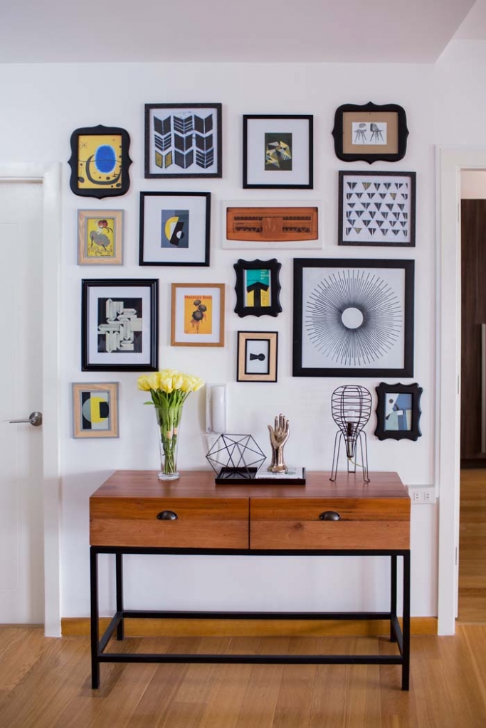
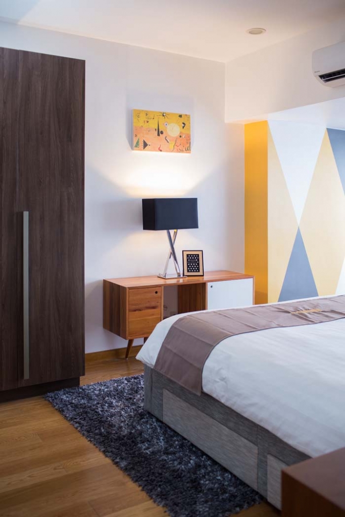
A vibrant choice, yellow can be overpowering when used excessively. Adding pops of the bright hue can keep your home looking lively and inviting. Get started by adding framed prints with hints of yellow or showcasing a vase of faux yellow blooms in your entryway.
Use it as inspiration for the color of your walls and furniture pieces.
It’s no secret that gray works wonders – whether you’re into modern, country, or industrial-inspired interiors. It’s such a versatile color choice that you can paint your walls or buy furniture in gray tones.
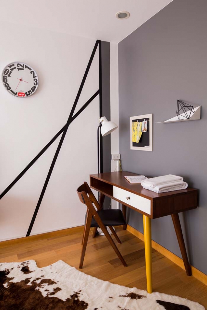
Styling tip: If you have a plain wall in your living area, you can spruce it up with geometric shapes without spending much. Using masking tape as your guide, you can paint the lines using a brush of your chosen size and black paint. This option is more budget-friendly compared to using wallpaper.
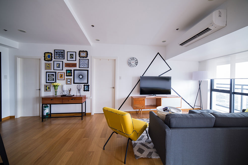
Keep the overall look from being boring by adding a touch of yellow to liven up an area. In your living area, you can have a gray sofa paired with a yellow accent chair and a gray carpet or area rug to anchor the space.
If accent chairs are too attention-grabbing, you can also complete a room in your home with striking yet comfy stools.
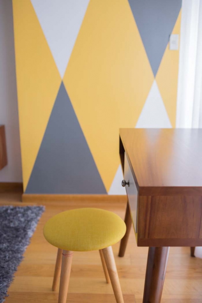
You can never go wrong with an accent wall.
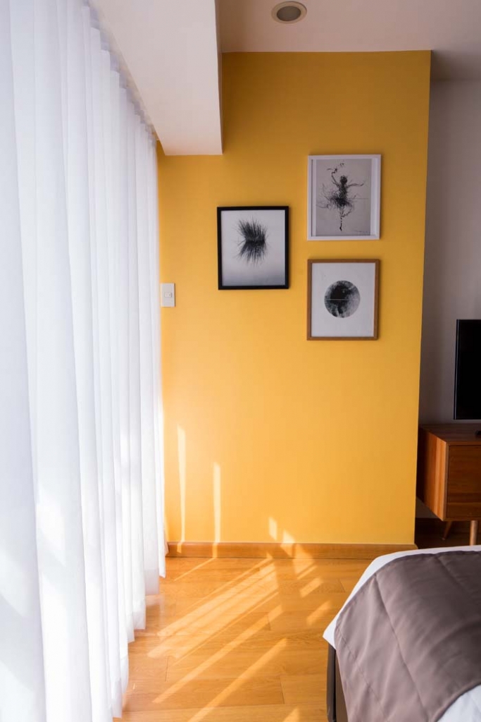
An accent wall can instantly catch one’s attention or break the monotony of having neutral-colored walls. In a room dominated by gray or cream-colored walls, a bold yellow accent wall adds an exciting touch.
Those who aren’t big fans of solid-colored walls can always bring out their inner artists by choosing a patterned approach and tempering yellow with lighter colors as seen in the wall below.
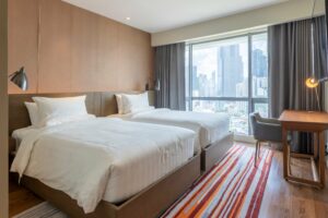
Neutral-colored bedsheets can help create a hotel-inspired sleeping space.
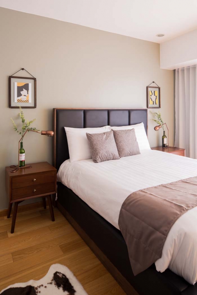
If gray walls seem too somber for you, showcase this flexible color option when shopping for soft furnishings. Gray or any neutral-colored curtains, pillow covers, and bedsheets can help you achieve a luxurious hotel-like feel you’ll love to come home to every day.
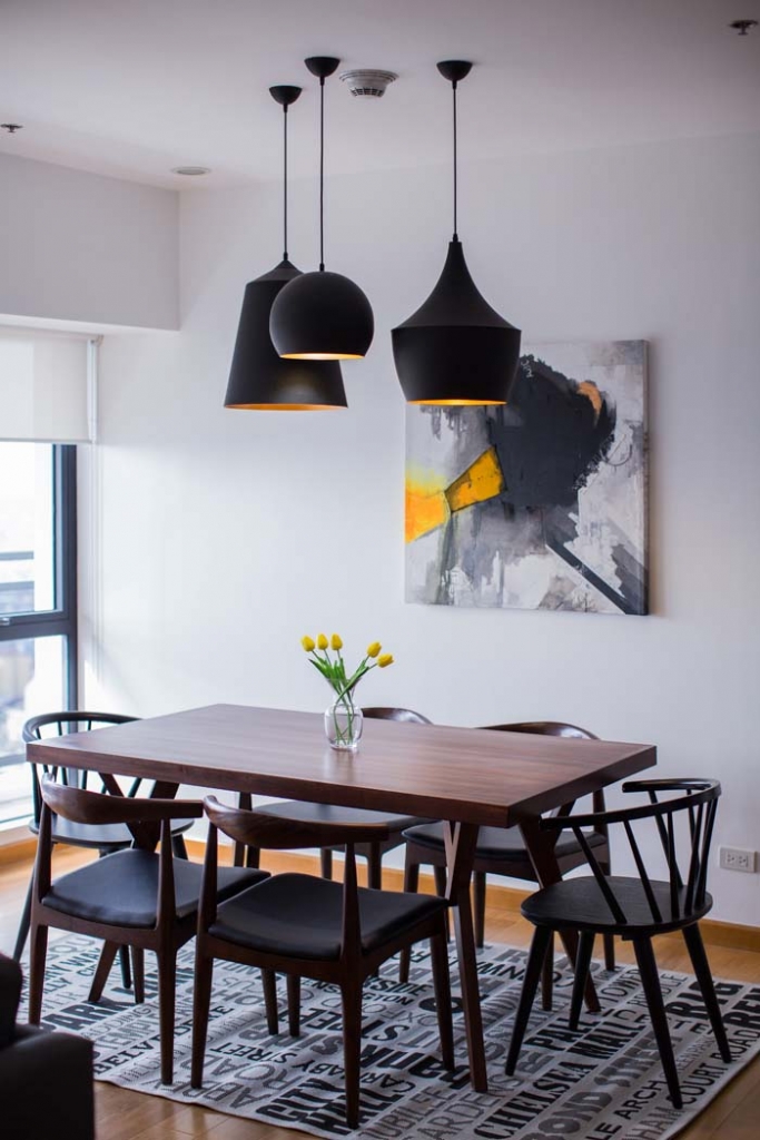
Be creative.
When it comes to working with colors, you’re not limited to big pieces and the walls in your space. Pique the interest of your guests and put their discerning eyes to the test by adding pops of your chosen hue creatively – it can be through an unexpected abstract painting like the one seen in the dining area or simply by painting one leg of your table in bold yellow. Smart, don’t you agree?
They say colors can make or break a space. Play it too safe and you might end up with a dull home, but if you take it to the other route and go all out – you risk the possibility of coming home to a tacky and uninspired space. The key to working with color is finding out which hues work well together. Experiment, mix-and-match, and look up pegs online. You can also log on to Pantone’s website for ideas or consult with a design professional to help you. Gray meets yellow is quite uplifting, but there are pairings that can also bring out the beauty of your space so you can achieve your own #condogoals.
In your own space, you can bring out your inner Picasso so you can express yourself. If you’re on the hunt for a home to call your own, Century Properties has residential developments in key areas in the city and in the province you can look into. Get started by learning more about The Residences at Commonwealth by Century in Quezon City, The Resort Residences at Azure North in San Fernando, Pampanga, and Batulao Artscapes in Nasugbu, Batangas.
Logging on to each property’s website allows you to take virtual tours, see the available units, and talk to a property specialist. You can even schedule a virtual tripping for a more personalized tour! Get started on your dream home today.
Special thanks to The Style Hobbyist, Julienne Cruz. Follow her on Instagram: @jules_thestylist. Photos by Paolo Feliciano.